Booky Illustration System
Branding System + Product Illustrations
for Booky
Project Lead: Charmaine Yu
Illustrations: Charmaine Yu & Sean Sonsona
Mockups: Elizabeth Joyce Chen
While working as an in-house illustrator for Booky, a food and lifestyle discovery and discounts app based in the Philippines, I initiated and developed the brand's first illustration system and color palette — a step toward unifying product illustrations and strengthening the brand's visual identity.

Booky's illustrations were everywhere — but they didn't look like they came from one brand.
Illustration was one of Booky's important tools for engaging users and showcasing partners — a way to stand out from photo and video content. But without a defined style, materials looked like they came from different brands entirely, not one cohesive identity.
Content was easily reposted without clear attribution, and the team spent real production time debating "what looks good for this piece" instead of working from a shared approach. Logo, type, and color had already been prioritized in Booky's brand system — illustration was the piece still left undefined, and the lack of one was starting to burn out the creative team producing high volumes of inconsistent work.
I built a system — not just a reference guide, but a framework that let any designer produce new, on-brand work without starting from scratch, built specifically to support brand recognition and faster production.

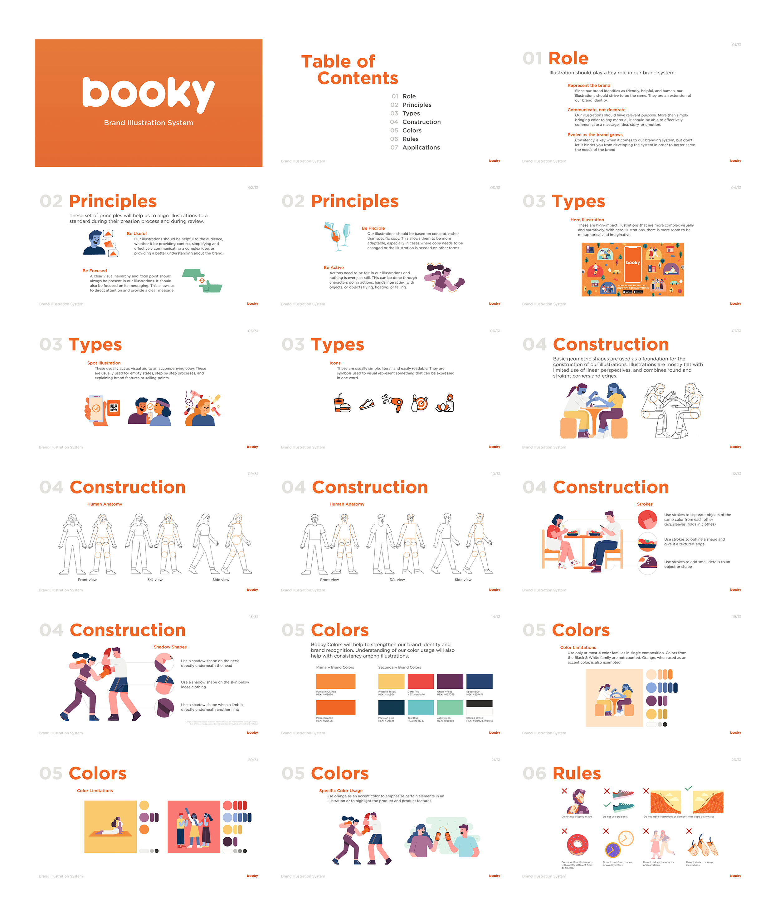
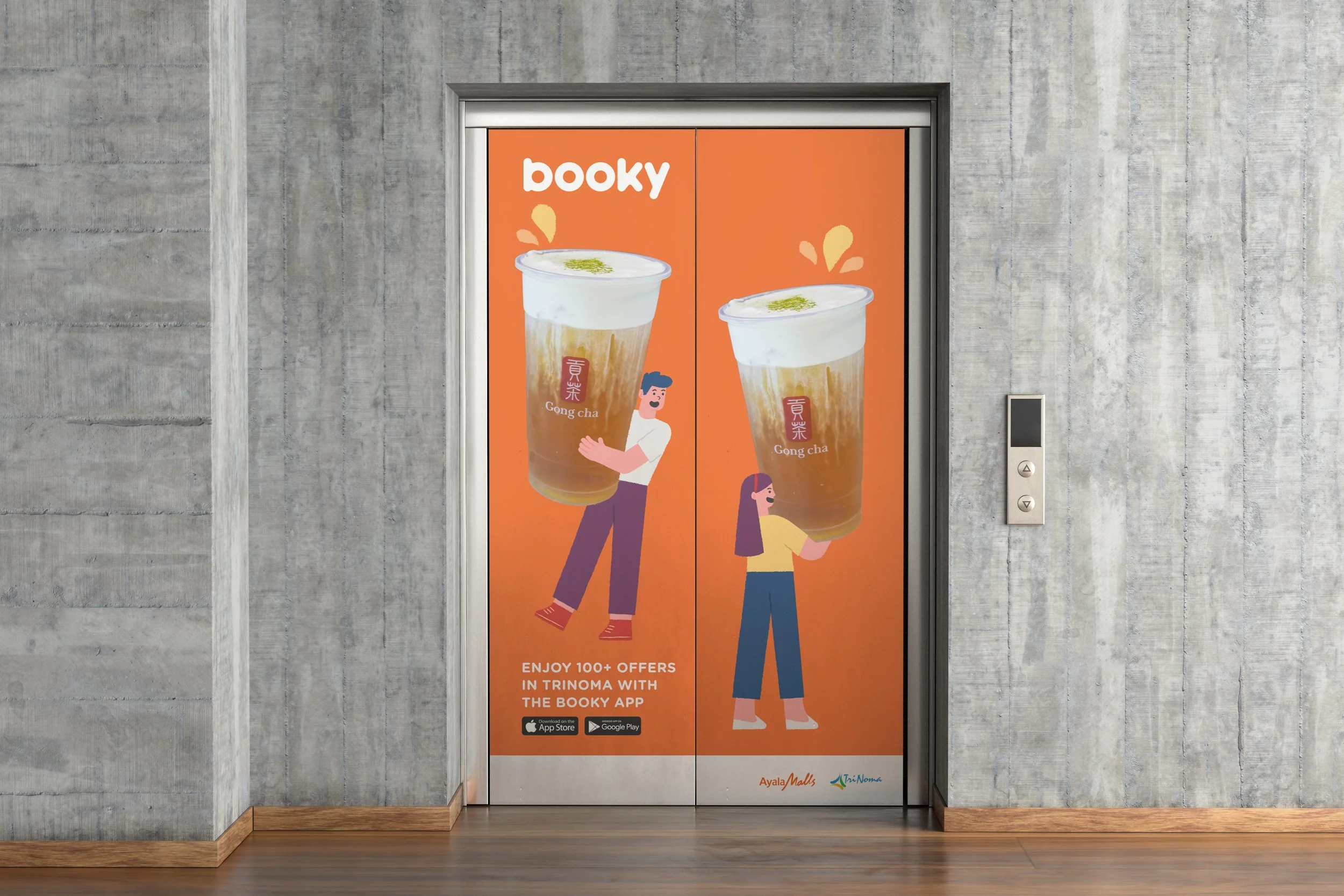
After researching how companies like Facebook and Slack used illustration systems to stay consistent at scale, I brought that thinking to the team and leadership, and together we defined the role illustration should play for Booky — then I made it concrete:
Documented construction rules, illustration types, color logic, and usage guidelines as a shared reference for the team
Built a color hierarchy where none existed before — primary and secondary colors and color families with defined tints and shades, applied differently by context: the brand color as an accent on smaller spot illustrations, but able to carry as a dominant background on larger formats like ads and murals
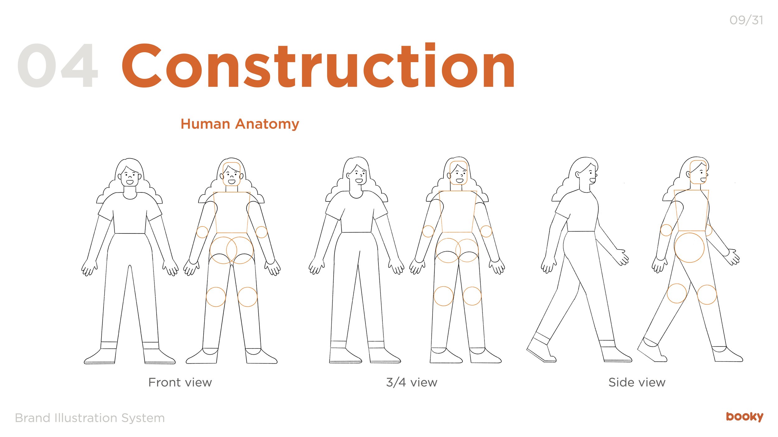
Used geometric, vector-based construction, partly inspired by Facebook's system — faster to build than hand-drawn illustration, and easier to rig for animation
Applied organic texture selectively and chose flat shadows over gradients, both for consistency across a large team of creatives
This system gave Booky a visual language where none existed before.
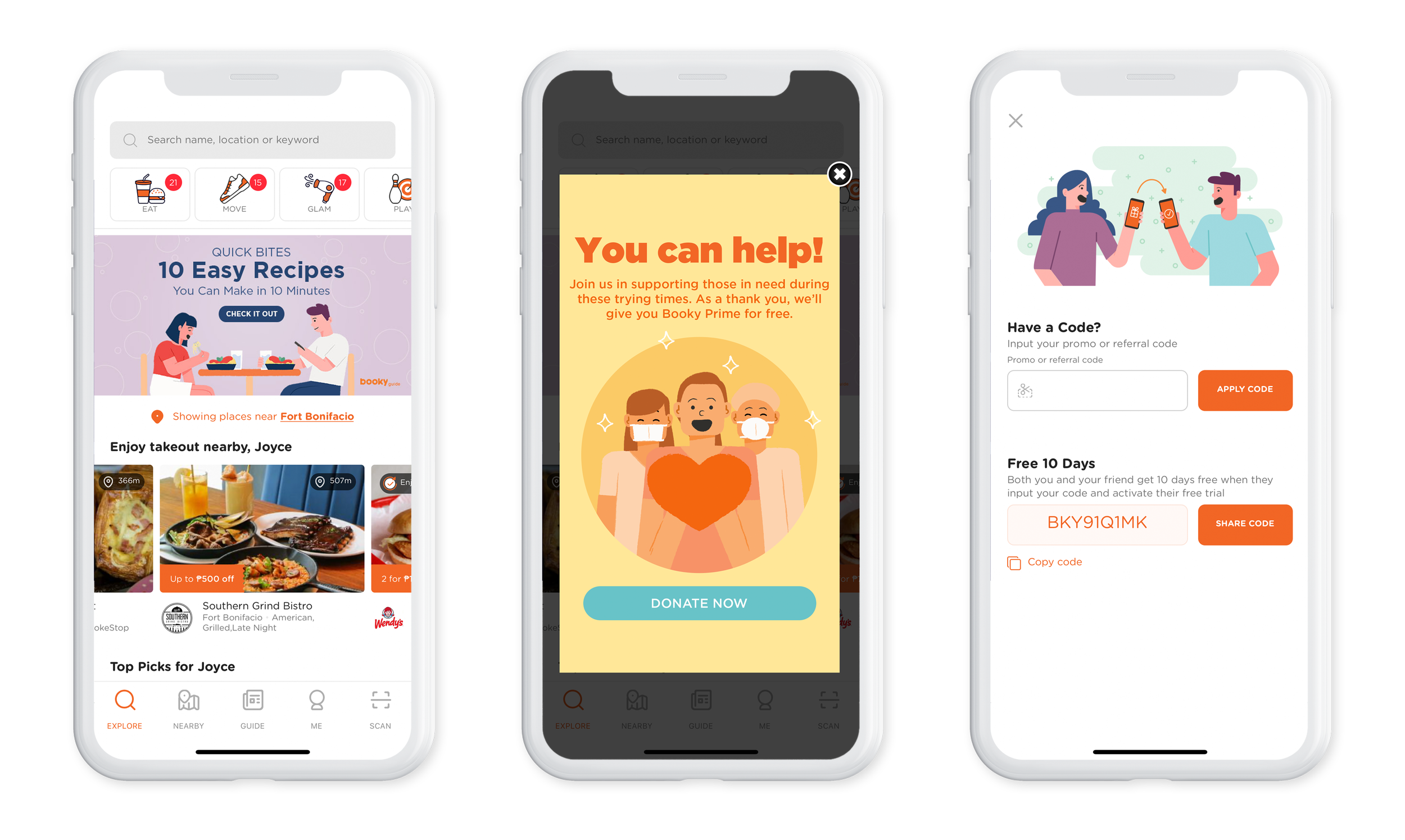
It became the shared reference for internal, client-facing, and product illustrations, with adoption into marketing materials like emails and ads. There was still work to be done by the time I moved on — integration into social media visuals and building out the illustration library were both still in progress — but it left a foundation the team could keep building on.

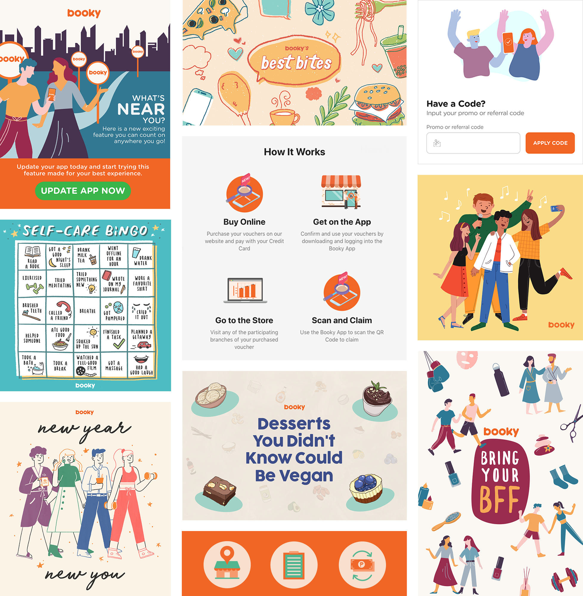
Selected Illustrations















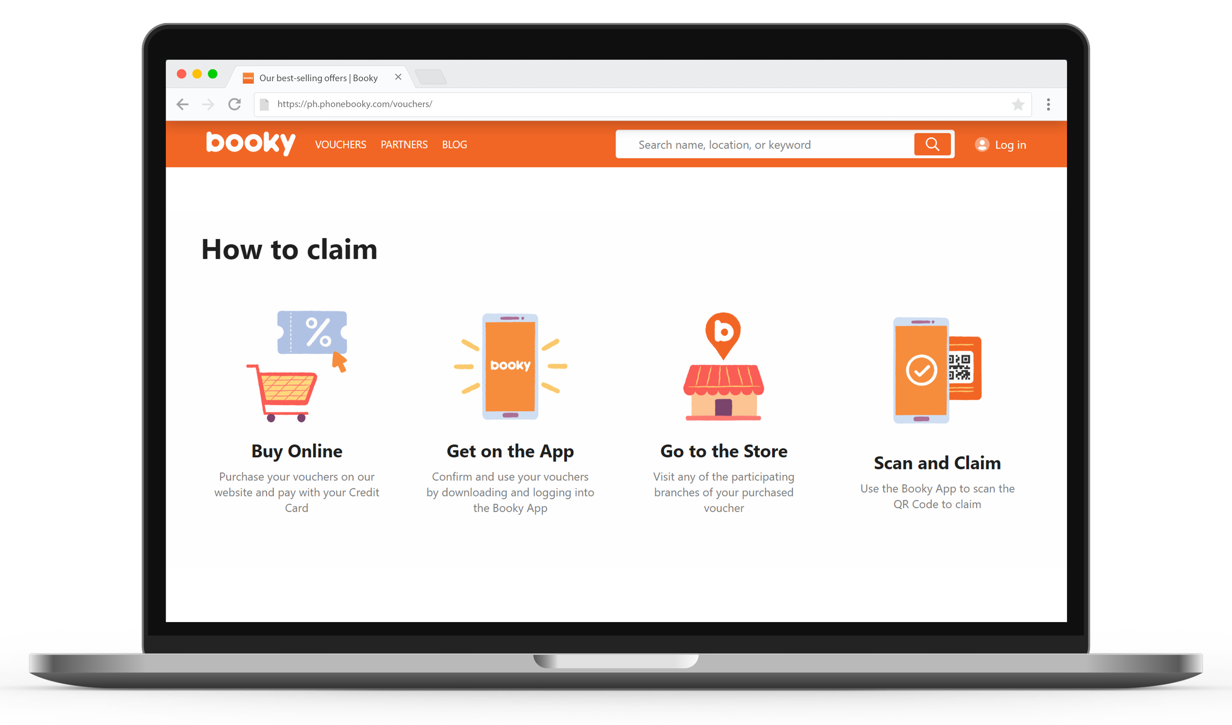
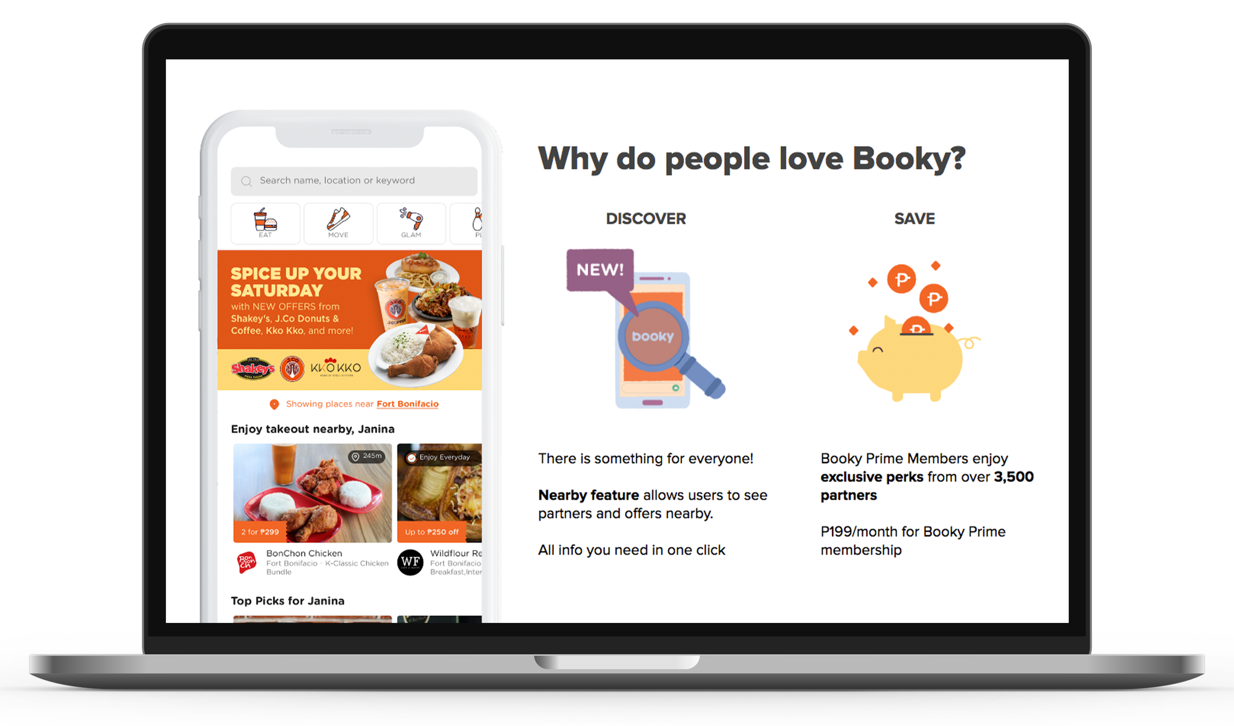
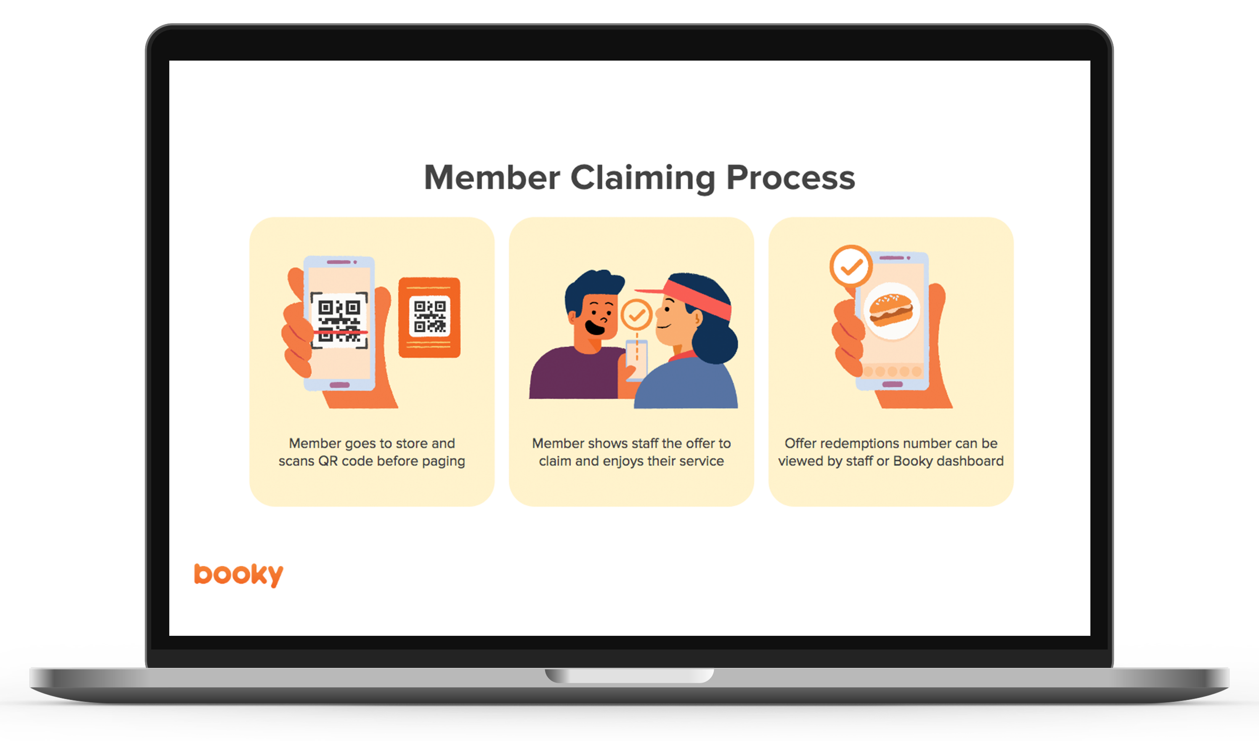
Selected Guideline Pages