The Punch Club
Brand Identity , Art Direction, Social Media
In 2021, during the pandemic, I became immersed in punch needling and noticed a growing curiosity about the craft in the Philippines — but a clear lack of accessible learning resources and starter materials. I founded The Punch Club to bridge that gap: a small, passion-driven business offering beginner workshops and curated materials kits, and built its brand identity from the ground up to reflect the playful, hands-on spirit of the crafting community.
Beyond branding, I ran the business end-to-end — from workshop instruction and materials sourcing to marketing content, customer communications, and shipping.

A brand-new business, with nothing yet to prove it.
The Punch Club had no track record, no existing audience, and no built-in trust — just an idea and a genuine passion for the craft. For people to sign up for a workshop or buy a materials kit from a stranger online, the brand itself had to do the convincing: it needed to look professional, considered, and worth the investment, without pretending to be something bigger than a small, personal venture.

I built a brand that felt considered, not improvised.
I defined the character I wanted The Punch Club to have — warm, welcoming, playful, curious, and community-minded, but still structured enough to feel legitimate rather than thrown together.
That system carried across everything The Punch Club put into the world — social posts and stories, workshop presentations, posters, and photography — so the brand felt consistent whether someone found it through an Instagram post or sat down for their first workshop.
Logo: a cat (curiosity & learning), a ball of yarn, and a punch needle — specific and memorable, not generic
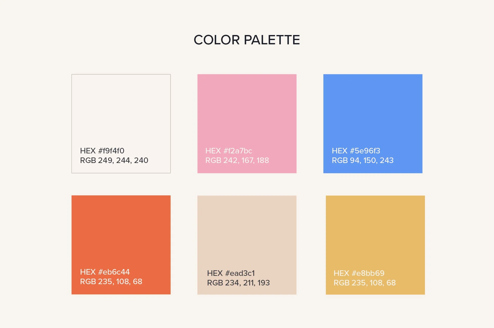
Color: off-white base drawn from monk's cloth, the canvas punch needling is made on — paired with warm, poppy accents colors, curated across light-to-dark values for legibility and black & white print flexibility
Type: a characterful headline typeface that’s structured rather than handwritten — since the craft itself relies on a frame, not free-flowing looseness — paired with Proxima Nova, a sans-serif with a strong range of weights, for legible body text across brand & marketing materials


The brand did its job — a business with nothing to prove earned enough trust for people to show up.
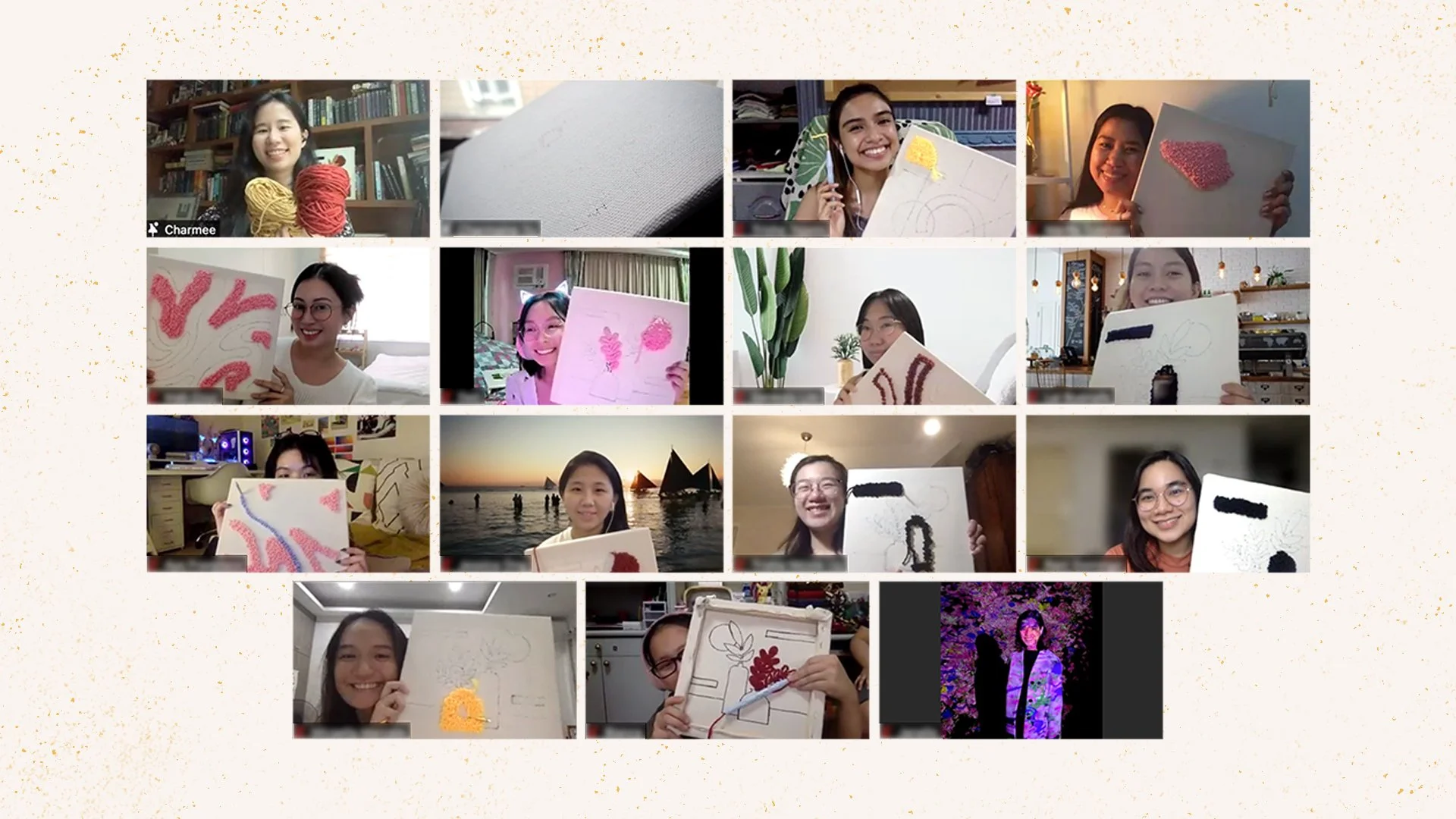
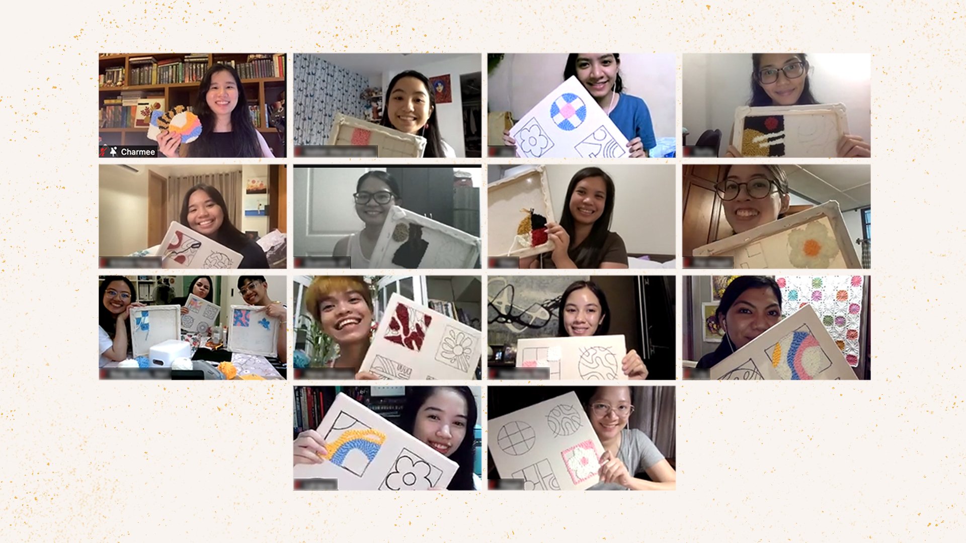
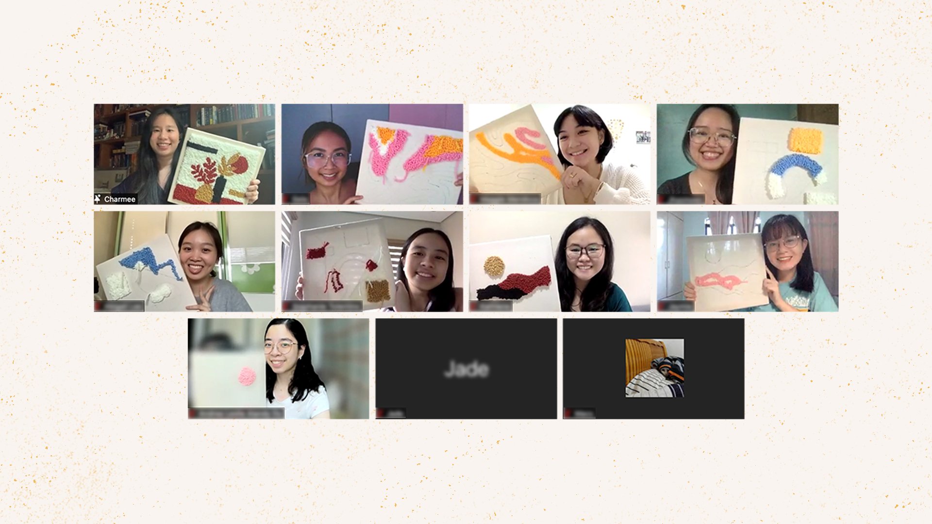
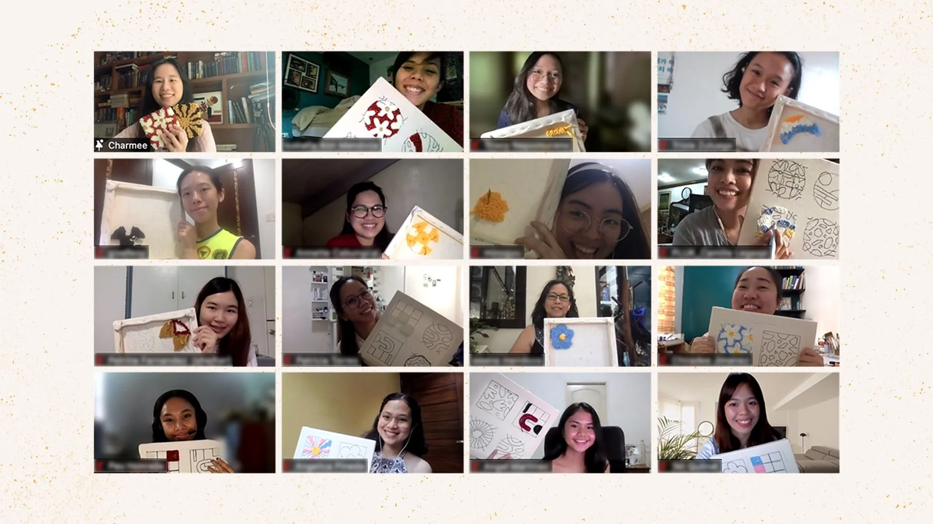
That trust translated into real participation: 7 workshops over 4 months, 83 participants, and a growing following on social media — helped along by marketing materials the brand consistently wherever people encountered it. The experience shaped how I think about brand design ever since: as something that has to earn trust, not just look nice.